Bayesian robust linear regression in Excel
An easy, quick and powerful way of doing Bayesian regression in a way that can be made appropriately robust to outliner, right in the tool most familiar to many people dealing with data. There will be more examples appearing here.
Motivation
Excel is a widely used tool and linear regression is one of the commonest task in data analysis. Bayesian analysis is not always necessary but when it is it is difficult in Excel. Here I show a simple, easy to do setup which allows this by leveraging Python modules.
I first came across some of the intricancies of Bayesian linear regression in this paper by Steve Gull SteveStraightLine. For a while I have used pyro and separately jax. I haven’t yet got around to using numpyro. I’ve used mixture models for a lot of recent analysis, so when I came across AstroNumPyro post combining all this into one, I thought, great: lets do this in Excel, with xlwings!
The mathematical model
The basic idea is that we have some observations \(Y\) which have a linear relationship to a known variable with some Gaussina-distributed error in the usual way:
\[\hat{y} = m \times \hat{x} + b\] \[Y \sim \hat{y} + \mathcal{N}(\sigma, 0)\]However, there is possibility of an outliar or glitch in the system which are drawn from from a fat-tailed (in this case, Cauchy) distribution:
\[Y' \sim \hat{y} + Q \mathcal{N}(\sigma, 0) + (1-Q)\textrm{Cauchy}(\gamma, 0)\]We are interested in learning about \(m\) and \(b\) given some observations \(Y\) made at exactly known \(\hat{x}\).
Demo
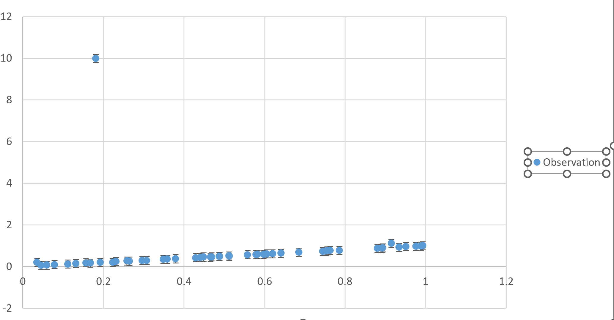
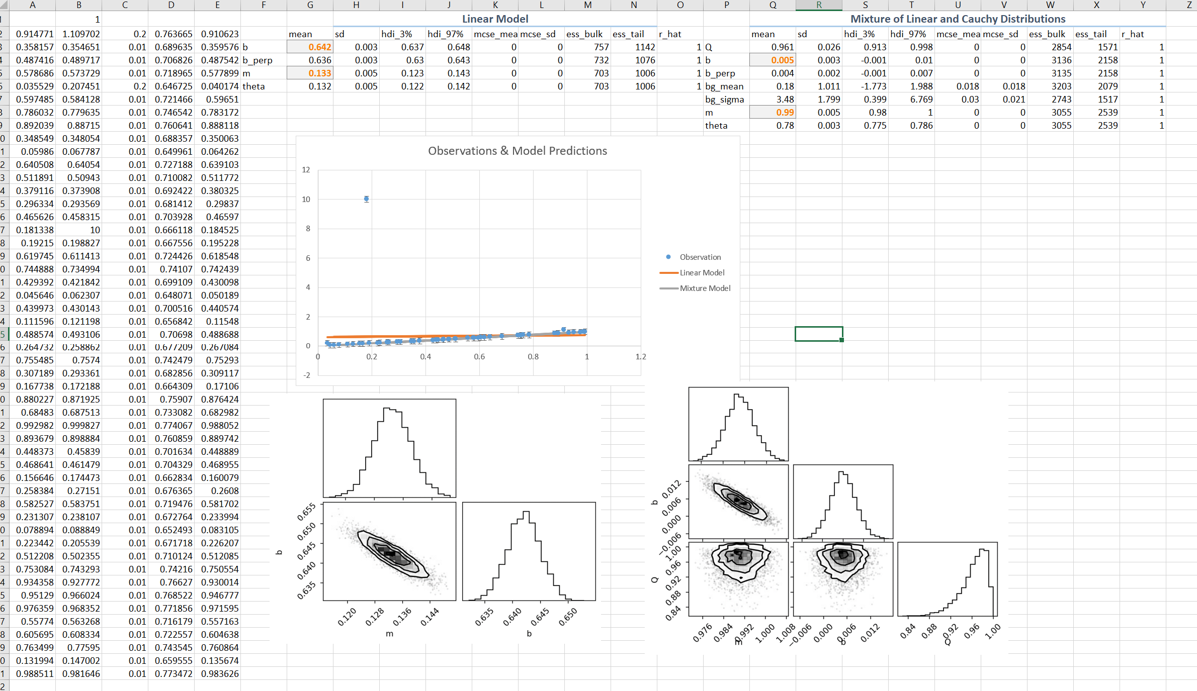
The simulated input data was generated with a linear model of unit slope, standard error of 0.01 and a single outlier value of 10. The abcissa values were sampled uniformly from the range zero to one. Here is the plot of the data with the outliner prominently visible:
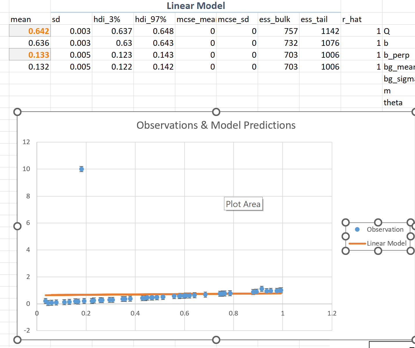
If we carry out a (Bayesian) fit using a simple linear model and assumed Gaussian error statists for the data we find the results are strongly biased by the single outlier:
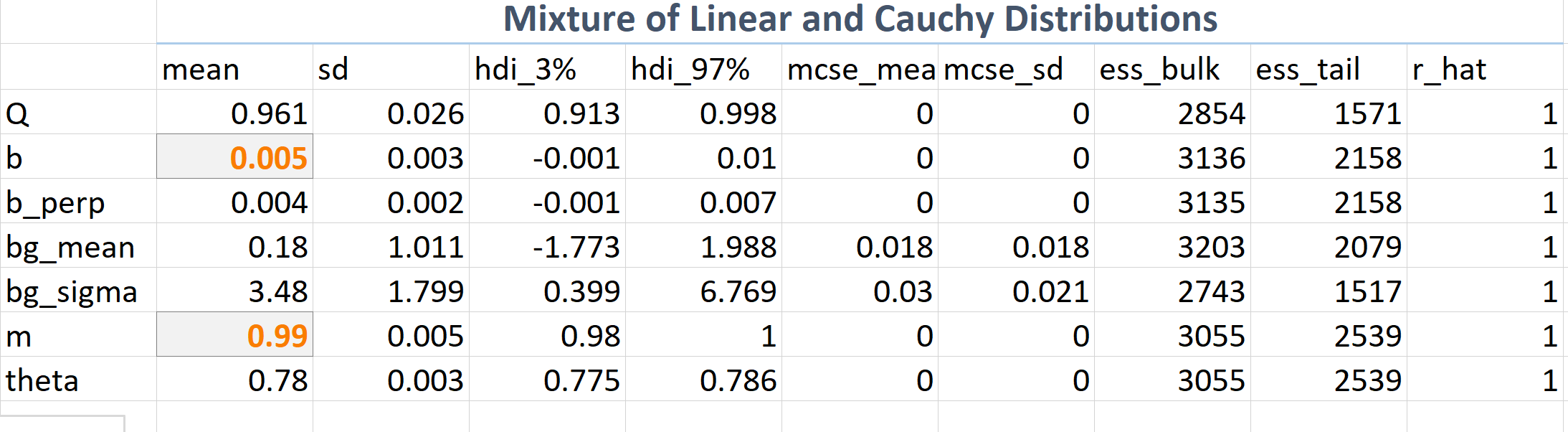
On other hand if we use a mixture model we find accurate values for the model parameters \(m\) and \(b\) that we are interested in, and also the \(Q\) which is the inference of the fractional effect of the Cauchy ad-mixture.
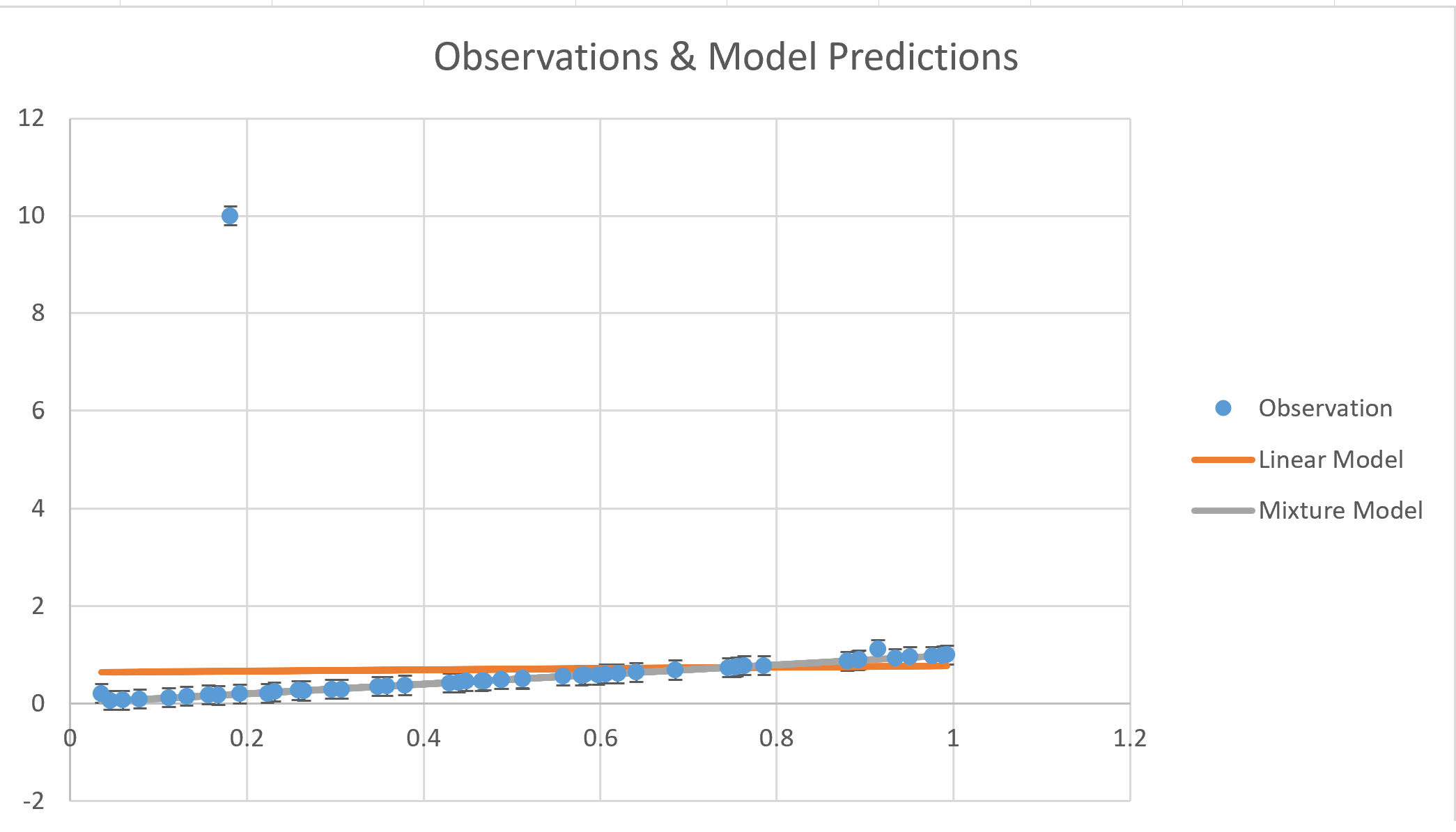
We can plot the mixture model estimate (gray line) showing an essentially exact fit to the true data trend:
Here is the whole spreadsheet showing this calculations:
How to do this
- Install and setup xlwings. Follow the instructions about trust settings for xlwings
- Install first Jax from JaxWindows,
pip install "jax[cpu]===0.3.14" -f https://whls.blob.core.windows.net/unstable/index.html --use-deprecated legacy-resolver - Then other necessary packages:
pip install numpyro pip install matplotlib arviz corner - Install the mixtures extension by DFM:
pip install git+https://github.com/dfm/numpyro-ext.git#egg=numpyro-ext -
The code for the regression is given in AstroNumPyro – I’ve modified to use Cauchy “background distribution”, i.e., the distribution of outliers
-
Use xlwings plotting capabilities to insert the matplotlib corner plots into the sheet:
@xw.func
@xw.arg('x', np.array, ndim=1)
@xw.arg('y', np.array, ndim=1)
@xw.arg('yerr', np.array, ndim=1)
def fitmix(x, y, yerr, caller):
   sampler = infer.MCMC(
       infer.NUTS(linear_mixture_model),
       num_warmup=2000,
       num_samples=2000,
       num_chains=2,
       progress_bar=False,
   )
   sampler.run(jax.random.PRNGKey(0), x, yerr, y=y)
   inf_data = az.from_numpyro(sampler)
   fig = plt.figure()
   corner.corner(inf_data, var_names=["m", "b", "Q"], fig=fig)
   caller.sheet.pictures.add(fig, name='Corner Plot mixture', update=True)
   return az.summary(inf_data)